Graphic Design Trends 2027

By Nebula Brand Labs · Published · Updated
What Are the Top Graphic Design Trends for 2027?
The top graphic design trends for 2027 are symbol logos that carry real meaning, type systems that pair a geometric display face with a warmer text face, and colour palettes built on deep base tones with one loud signature accent. Underneath all three is a shift from decoration to discipline: fewer elements, each doing more work.
Trend lists usually stop at mood boards. This one is for founders and designers who need to make actual decisions. For each trend, we show how it works in a real identity: SEMITONES, a music-inspired contemporary clothing brand whose identity we designed at Nebula Brand Labs.
Logo Design Trends 2027: Symbols With Layered Meaning
In 2027, the strongest logos are simple in form but carry more than one idea. A mark that tells a story gives people something to remember and repeat, which a generic monogram cannot.
Symbol Logo Design Example: The SEMITONES Koi and Record
The SEMITONES symbol shows two koi fish circling each other in a still pond. The ripples beneath them spread out in concentric rings that form a vinyl record. Koi stand for perseverance, harmony and good fortune in Japanese tradition. The record links that heritage to music and contemporary culture. One emblem, two worlds.
The execution stays disciplined: minimal forms, a single bold colour and clean negative space, so the mark reads clearly at any size.
Flexible Logo Lockups for Every Format
A 2027 logo needs to be a family, not a single file. The SEMITONES system has three lockups, each with a defined job:
• Horizontal (primary): about 80% of uses — website headers, signage, email signatures and banners
• Stacked: square and vertical spaces such as social posts, posters, tote bags and apparel
• Standalone symbol: small spaces where the name is already known — app icons, favicons, stickers, vinyl centre labels and packaging details
The rule we wrote into the guidelines is worth borrowing: use the symbol as a signature, never as the first introduction.
Typography Trends 2027: Geometric Headlines, Warm Body Text
Typography in 2027 pairs confident geometric display faces with softer, more human text faces. The contrast gives brands authority in headlines and warmth in longer reading.
Brand Typography System Example: Geom and Gotham Rounded
SEMITONES uses Geom for headings, Gotham Rounded for subheadings and body copy, and Fraunces, a serif, as an alternative for editorial moments. The wordmark is the only all-caps element; everything else is set in sentence case. That one rule keeps the brand calm on screen and on a hangtag alike.
Our take: if your type system needs more than three typefaces, it isn't a system yet.
Colour Trends 2027: Deep Bases and One Loud Note
The colour trend for 2027 is restraint with a signature. Warm neutrals and deep, nocturnal tones set the mood, and a single saturated accent becomes instantly recognisable because it is used sparingly.
Brand Colour Palette Example: Night, Pearl and Medium Carmine
The SEMITONES palette is designed like a record sleeve:
• Night (#102827) and Atomic Black (#0F0F0F) — the deep base notes, quiet and confident
• Bright Pearl (#FFFAEB) and Blinding White (#F6FFFF) — warm and cool space to breathe
• Medium Carmine (#C53137) — the one loud note, like the label at the centre of a record
The key rule: carmine is never used as a background. It is always a moment, never a field. That restraint is what makes the red storefront, the logo block and a single carmine headline feel unmistakably SEMITONES.
Extended and Accent Colours That Don't Take Over
Each core colour extends into tints and shades — carmine runs from oxblood to blush, Night opens into teal and pale aqua. Brighter accents such as emerald, cerulean and amber are used only for graphic artwork and functional cues, one or two at a time, and never next to the wordmark. Range without losing the brand's voice.
Pattern Design Trends 2027: Cultural Motifs, Used Lightly
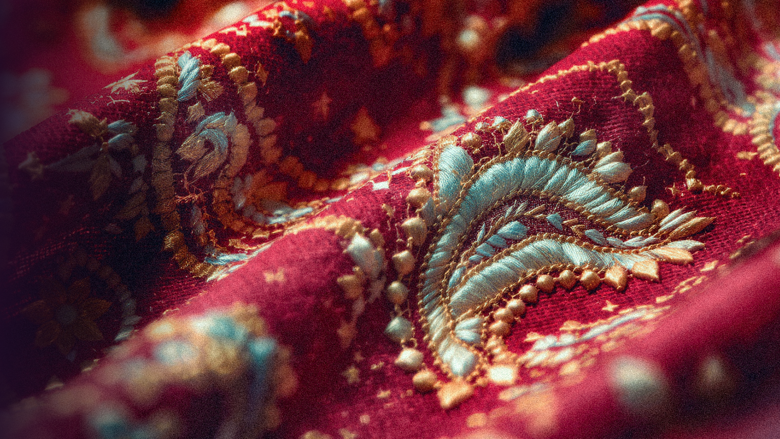
Brands are borrowing from cultural and traditional visual languages, but with a lighter touch. The SEMITONES pattern library draws on Japanese graphic motifs — ripples, koi and brush marks — designed as seamless repeats for packaging, labels and store surfaces. They add depth without overpowering the logo or the product.
Beyond Visuals: Designing How a Brand Sounds
The most complete identities in 2027 design the words as carefully as the logo. SEMITONES has a "tone dial" borrowed from musical dynamics: quiet (p) for customer care, present (mf) for social captions, full (f) for drop launches — and never ff, which means no shouting, no all-caps sales copy. One voice, with the volume set by the moment.
Graphic Design Trends 2027: Frequently Asked Questions
How Many Colours Should a Brand Palette Have?
Most strong palettes have three to five core colours, with one clear signature accent. Extended tints and a few functional colours can sit around them, as long as the core colours always lead.
Should My Logo Include a Symbol or Just a Wordmark?
A symbol helps where space is tight — app icons, social avatars, packaging details — and gives the brand a story to tell. If you add one, make sure it carries meaning and works at very small sizes.
How Often Should a Brand Update Its Visual Identity?
Most brands need a refresh every five to seven years, not a full redesign. Updating type, colour usage and applications usually keeps an identity current without losing the recognition you have built.
Design an Identity That Holds Up Everywhere
At Nebula Brand Labs, a Mumbai-based 360° branding and marketing studio, we design complete identity systems — logo, type, colour, patterns and voice — for brands across India and worldwide. Our free audit shows how consistent your brand is today, for people and for AI search.